Sehr viel - und manchmal verwirrend steht auf der Englischen Seite von Wikipedia:
http://en.wikipedia.org/wiki/Urban_heat_island
Interessanterweise hat Wikipedia.de nicht viel über den Wärmeinseleffekt.
http://de.wikipedia.org/wiki/Stadtklima
Daher mal ein umfassender Artikel von Josef Kowatsch über die möglichen Auswirkungen des Wärmeinseleffekts.
http://www.wahrheiten.org/blog/2011/01/27/waermeinseleffekt-taeuscht-klimaerwaermung-vor/
(die Website dazu scheint mir allerdings ein bisschen zu viel in Richtung Verschwörungstheorie zu gehen, was aber dem Geschriebenen nicht entgegensteht...)
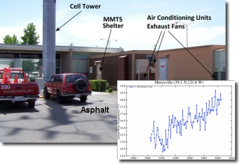
Und hier ein Bild von http://www.surfacestations.org/ das eine nicht so optimal gepflegte Station und die entsprechende Temperaturkurve dazu zeigt.
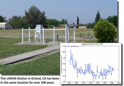
Im Gegensatz dazu eine gepflegte Station:
Eine Erklärung auf Englisch:
WHY ARE TEMPERATURES COOLER IN RURAL AREAS?
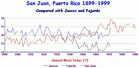
Hier weltweit einige städtische Temperaturlinien verglichen mit dem Umland. Ein bis 2 Grad macht der Temperaturunterschied zwischen Land und Stadt schon aus. Was auch die Thermometer-Aufzeichnungen verfälscht:
San Juan, Puerto Rico. This is an urban station in the Caribbean, but it is compared on the graph with nearby rural stations Fajardo and Juncos, both of which do not show the warming trend exhibited at San Juan. It demonstrates clearly the effect urbanisation has in skewing temperature data. Data to 1999
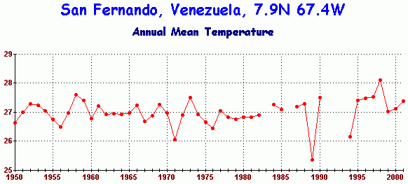
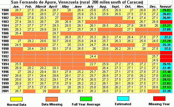
San Fernando de Apure, Venezuela. A rapidly growing city station 100 miles south of Caracas. See also a 20-year extract of data which shows data fragmentation problems, typical of third world data. Data to 2001
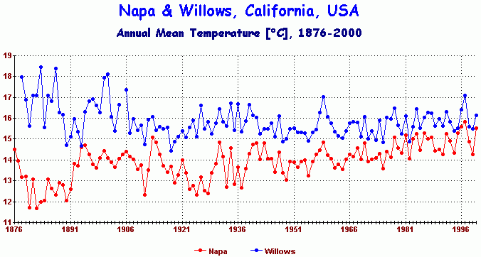
Napa & Willows, California, USA. Actually, Napa is closer to San Francisco than Santa Rosa (previous) and shows a steady urban warming compared with rural Willows. Data to 2000
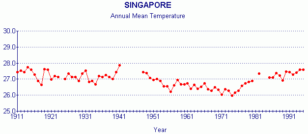
Singapore. An over-heated city, so it doesn't really belong here, but here it is anyway. Data to 1995
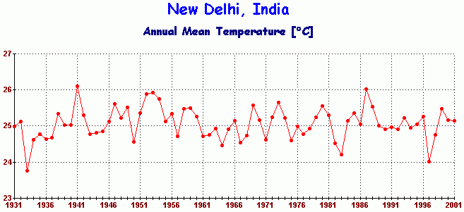
New Delhi, India. This is a city of 8 million people. In spite of being heavily urban, it shows no sign of warming. Data to 2001
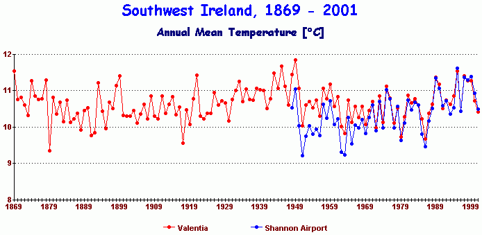
Valentia Observatory & Shannon Airport, Ireland. A second chart comparing Valentia, Shannon and Roche's Point.
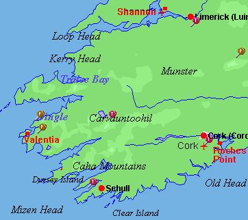
Valentia lies on the southwest tip of Ireland, directly facing the North Atlantic Ocean and is the first point of contact in Europe for the Gulf Stream. This is a particularly valuable record as it is a clean rural record running from 1869 to 1999 and has been under scientific supervision, in a very strategic climatic location. Shannon Airport and Roche's Point are used for comparison and shows a developing heat island at Shannon. Map of the area. Data to 2001
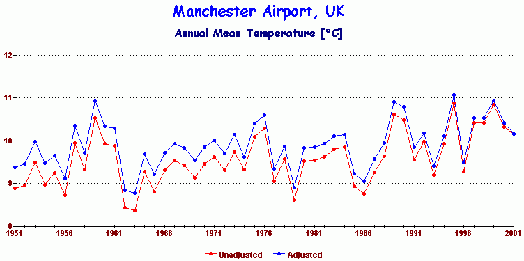
Manchester Airport. Adjusted & unadjusted records. Demonstrates inadequacy of heat island adjustment. Data to 2001
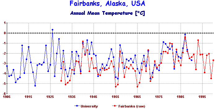
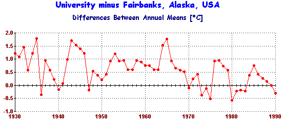
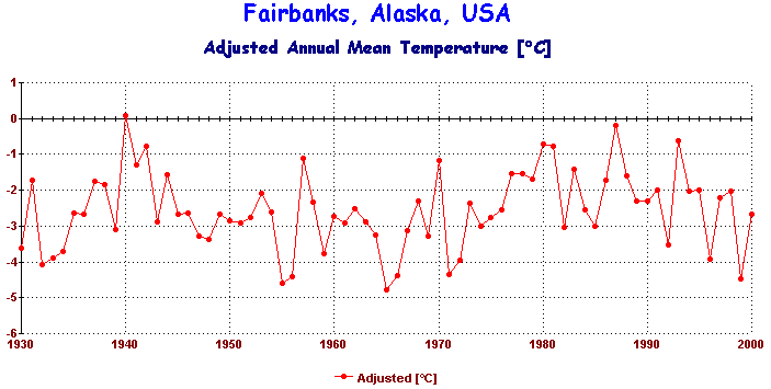
Fairbanks, Alaska. Case study in urbanisation - Raw data for city and university - data differences between them - Fairbanks adjusted by NASA-GISS for urbanisation. Data to 2000
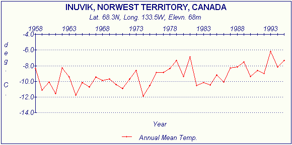
Inuvik, Northwest Territory of Canada. Between 1958 and now Inuvik has gone from a little Inuit fishing village to a significant petroleum base, possibly affecting its record. Data to 1995
Keine Kommentare:
Kommentar veröffentlichen